How to Choose the Best Colors for Your Bathroom

Choosing the perfect color for a bathroom is more than just picking a shade that looks good. Colors also create an atmosphere that aligns with your needs and preferences. The right color can make a small bathroom feel larger, a large bathroom feel cozy, or an ordinary space into a spa-like retreat.
Beyond aesthetics, colors impact emotions, energy levels, and even functionality. Some colors create a soothing effect, perfect for unwinding after a long day, while others bring vibrancy and energy, making them ideal for a morning routine. Additionally, elements like lighting, bathroom size, materials, and finishes all influence how a color appears in a space.
This detailed guide explores everything you need to know about choosing the best colors for your bathroom. You will learn about color psychology, design principles, trending palettes, expert recommendations, and easy updates to refresh your bathroom without a major renovation. Plus, you will learn how Weinstein Bath & Kitchen Showroom can help you bring your vision to life.
The Emotional Impact of Color in a Bathroom
Color psychology plays a significant role in how a bathroom feels and functions. Different shades evoke different emotions, and choosing the right color can enhance relaxation, productivity, or warmth.
How Different Colors Influence Mood and Energy
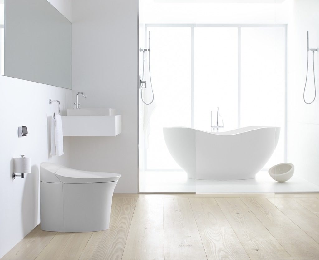
- White: Represents cleanliness, simplicity, and freshness. White bathrooms feel airy and open, making them popular choices for modern and minimalist designs.
- Beige & Taupe: Warm, neutral colors that create a cozy and inviting atmosphere. These shades work well in both classic and contemporary spaces.
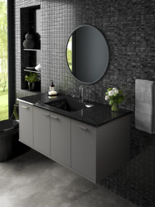
- Gray: Versatile and sophisticated, gray can be warm or cool. Light grays create an airy feel, while darker shades add depth and contrast.
- Blue: Known for its calming and tranquil qualities. Light blues create a refreshing spa-like atmosphere, while navy or deep teal add boldness and elegance.
- Green: Symbolizes balance and nature. Sage and moss green bring a soft, earthy feel, while deep greens like emerald create a luxurious touch.
- Yellow: Bright and cheerful, yellow brings warmth and energy. Pale yellows create a welcoming effect, while deeper shades add richness.
- Pink: Soft pinks like blush and rose add a delicate and romantic feel. Bolder pinks, such as coral, introduce warmth and personality.
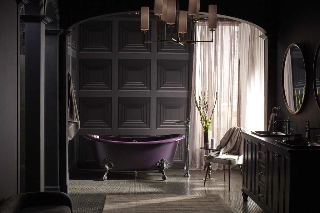
- Black: Dramatic and bold, black adds a high-end, modern touch. Matte black fixtures and accents are trending in contemporary bathroom designs.
- Brown: Earthy and grounding, brown tones like mocha, caramel, and espresso create a warm and comforting atmosphere.
- Purple & Violet: Associated with luxury, spirituality, and creativity. Soft lavenders are soothing, while deep purples add richness and depth.
How to Use Color to Change the Perception of Space
Color can influence how a bathroom’s size, height, and proportions are perceived. Specific shades and design techniques can make a small space feel bigger, or a large bathroom feel cozier.
- Making a Small Bathroom Feel Larger
- Use light colors, such as white, soft gray, or pastel tones, to reflect light and create an open feel.
- Avoid high contrasts—keeping walls, floors, and fixtures in similar shades helps create visual continuity.
- Use glossy finishes to bounce light around the room, enhancing brightness.
- Opt for large tiles in neutral shades to reduce visual clutter and create a seamless effect.
- Creating a Cozy, Intimate Bathroom
- Use warm, deep colors like charcoal gray, terracotta, or forest green to add richness.
- Contrast with lighter accents to create a dynamic look without making the space feel too dark.
- Add textured elements such as wooden bathroom cabinets, stone countertops, or matte tiles for depth.
- Adjusting Ceiling Height with Color
- To visually lower a high ceiling: Use warm or dark colors on the ceiling to create a cozier feel.
- To make a low ceiling feel taller: Choose light, cool colors such as white, pale blue, or light gray.
- Altering the Proportions of a Bathroom
- To make a narrow bathroom feel wider: Use horizontal stripes or paint the longest wall slightly darker.
- To make a long bathroom feel shorter: Paint the narrow walls in a darker tone to bring them visually closer.
Incorporating Color Through Different Bathroom Elements
While wall paint is essential, the best colors for your bathroom can also be introduced through other elements to enhance the bathroom’s design.
Ways to Introduce Color Beyond Wall Paint
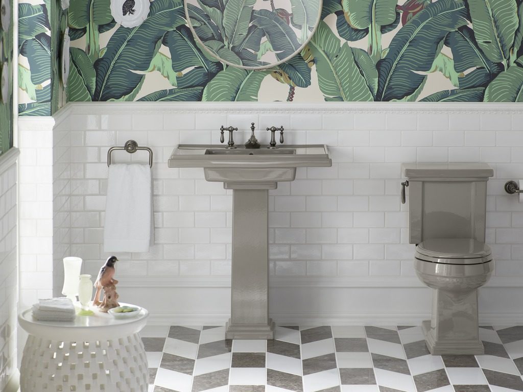
- Tiles: Patterned, textured, or colored tiles add vibrancy and personality to a bathroom.
- Vanity & Cabinets: Painted vanities in deep blues, greens, or pastels create a focal point.
- Fixtures & Hardware: Matte black, brushed gold, or copper fixtures can complement a bathroom’s color scheme.
- Bathtub & Sinks: Freestanding bathtubs in darker tones or pastel shades create a luxurious feel.
- Accessories & Décor: Towels, rugs, shower curtains, and artwork are easy ways to introduce pops of color without a permanent change.
Creating a Spa-Like Bathroom with Color and Lighting
A spa-inspired bathroom should feel relaxing and luxurious. The right color combinations and proper lighting can enhance this tranquil atmosphere.
Best Color Palettes for a Spa-Like Bathroom
- Soft Neutrals: White, beige, and taupe provide a clean and calming foundation.
- Earthy Greens: Sage, eucalyptus, and olive bring a natural and refreshing vibe.
- Coastal Blues: Light blue, seafoam, and aqua evoke the calming nature of water.
Enhancing the Spa Experience with Lighting
- Dimmable LED lights allow you to control brightness and mood.
- Warm lighting enhances relaxation, while cool lighting makes the space feel fresh.
- Backlit mirrors provide soft, indirect lighting for a modern touch.
Additional Elements for a Spa-Like Feel
- Use natural materials like wood, stone, and bamboo.
- Incorporate aromatherapy with candles or essential oil diffusers.
- Add greenery like potted plants for a fresh, organic feel.
Choosing the Right Paint Finish for a Bathroom
Bathrooms have high moisture levels, so choosing the right paint finish ensures durability and longevity.
Best Paint Finishes for Bathrooms
- Satin Finish: Offers a subtle sheen and is moisture-resistant, making it ideal for bathroom walls.
- Semi-Gloss Finish: Highly durable and easy to clean, perfect for high-humidity spaces.
- Matte Finish: Provides a modern, elegant look but requires a moisture-resistant formula.
Trending Bathroom Color Palettes
Color trends evolve, and modern bathrooms are seeing a mix of timeless and bold color choices.
Current Bathroom Color Trends
- Crisp White & Soft Gray: Still a top choice for bathrooms to create a modern, clean look.
- Moody & Dark Tones: Navy blue, charcoal, and forest green are gaining popularity.
- Warm Neutrals: Taupe, caramel, and almond tones bring warmth and sophistication.
- Two-Tone Walls: A light shade on top and a darker tone on the bottom create depth.
Expert Tips for Overhauling or Refreshing a Bathroom’s Color Scheme
If you want to update your bathroom, you can opt for a complete transformation or make simple, cost-effective updates.
Full Bathroom Color Overhaul Ideas
- Go Bold with Dark Tones: Deep blues, blacks, and greens make a striking statement.
- Try a Monochromatic Theme: Stick to one color in varying shades for a seamless look.
- Introduce Color Through Tiles: Patterned or colorful tiles add personality and texture.
Quick & Affordable Bathroom Color Updates
- Paint an Accent Wall: Choose a bold shade for added depth.
- Refresh the Vanity: Repainting a vanity in navy, green, or gray modernizes the space.
- Update Fixtures & Hardware: Swap out faucets and handles for matte black or brushed gold.
- Change Accessories: Towels, rugs, and artwork in trending colors can instantly refresh the space.
How to Get Started with Your Bathroom Color & Design
Transforming your bathroom into a personal sanctuary begins with carefully considering color and design. This space is a functional area and a retreat where you can unwind and rejuvenate. Embark on this exciting journey and explore the elements that resonate with your style while harmonizing with the overall vibe of your home. This section will guide you through selecting the perfect color palette and design themes, ensuring your bathroom reflects beauty and comfort.
Step 1: Visit the Showroom for Inspiration
Browsing online is a great start, but nothing compares to seeing bathroom products and fixtures in real life. Visit the Weinstein Bath & Kitchen Showroom in Broomall to explore different bathroom styles, color palettes, and materials.
Step 2: Meet with a Design Consultant
A design consultant will walk you through the best colors for your bathroom, fixtures, and layout ideas to ensure your bathroom is beautiful and functional. Book an appointment for a personalized consultation, or drop in to explore at your own pace.
Step 3: Choose Your Perfect Color Scheme & Finishes
Not sure where to begin? Let Weinstein’s experts guide you through popular color trends like:
- Classic white & soft grays – For a timeless, fresh look.
- Warm neutrals & earthy tones – For a cozy and inviting atmosphere.
- Bold, moody hues – For a dramatic, modern aesthetic.
- Spa-inspired greens & blues – For a serene and relaxing retreat.
Match your color scheme with coordinated fixtures, hardware, and accessories to complete your dream bathroom.
H3: Step 4: Get the Products You Need
Once you make your selections, Weinstein will help you order the best fixtures and accessories to bring your vision to life. Their full-service plumbing supply counter and warehouse ensure you get everything you need for your renovation project.
Step 5: Enjoy Your New Bathroom
With the right colors, fixtures, and expert guidance, your newly designed bathroom will be a space you love to use daily.
Find the Perfect Bathroom Colors at Weinstein Bath & Kitchen Showroom
Weinstein Bath & Kitchen Showroom offers various colors and finishes to help homeowners find the perfect choice. Whether designing a spa-like retreat, a modern monochrome space, or a cozy and inviting bath, Weinstein Bath & Kitchen experts can provide guidance and inspiration.
Why Choose Weinstein Bath & Kitchen Showroom?
- Extensive Product Selection – Vanities, faucets, tubs, tiles, and accessories in various colors and finishes.
- Expert Color & Design Consultations – Personalized assistance in choosing the best color schemes.
- Hands-On Experience – View full bathroom displays, test color combinations, and explore the latest trends.
- Support for Homeowners & Professionals – Tailored guidance for DIY enthusiasts, contractors, and interior designers.
Visit the showroom to explore expertly designed vignettes or mix and match colors to create a personalized bathroom. The team is ready to assist with everything from choosing the best colors for your bathroom to selecting fixtures that complement the overall design. Stop by today or schedule an appointment to transform your bathroom with the perfect color palette.